I was enthralled that the school were happy for me to come and teach the kids Graphic Design. Which is odd because if I’m honest I’m not someone who generally likes being around kids. You know when you see a group of kids at a party, a beach, at a sports venue etc. there’s always one or two adults who’s hyping the kids up, creating fun games and generally having a cracking time with them… Yeah that’s not usually me, I’m more reserved. So I was shocked with the amount of enjoyment I got from teaching children about Graphic Design. It is incredibly rewarding and the talent and knowledge some of them have is incredible at such a young age.
As I mentioned in my last post (Talking to kids about graphic design – Part 1) I wanted to talk to the children as I would adults. My idea for the term was simple:
- Give them an introduction into branding
- Ask them to create a new brand from scratch, following a design brief
- Review their work in front of the class
- Print up some merch with their designs as a surprise for the end of term
First step an introduction into brands…
I started as all good stories should, at the beginning. Hieroglyphs are the first known comprehensive alphabet using symbols.
We discussed how they can communicate messages and I was enthralled to know that the kids had been studying Egypt so were well versed in the subject.
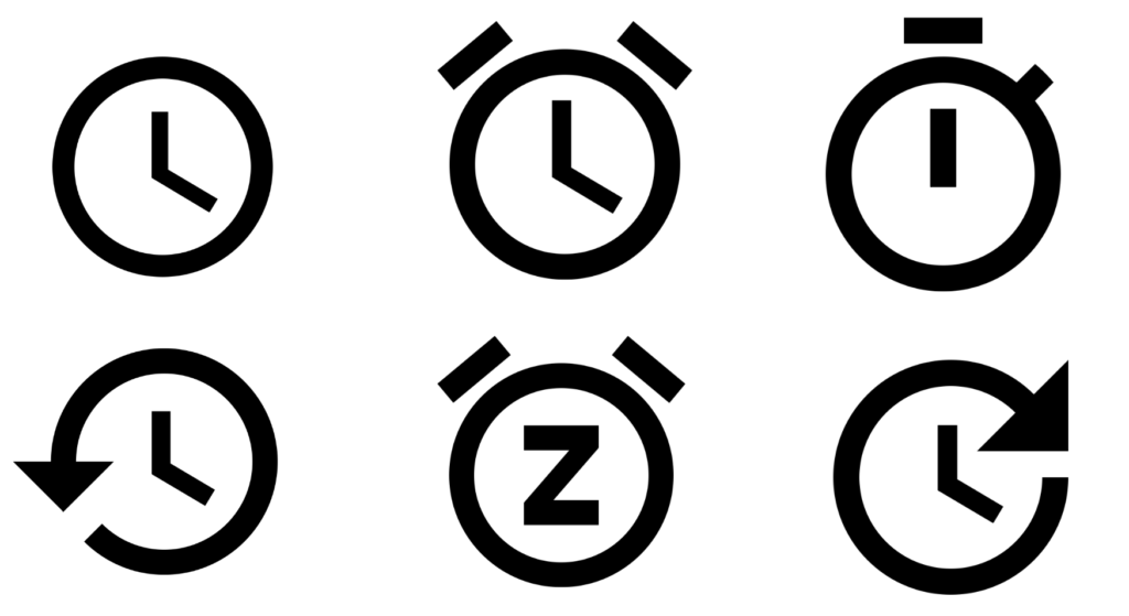
Then I wanted to discuss how designers can use the simplest shapes to make an icon. With the icon informing people what the subject is. I used a simple clock for the example. One circle and two lines. I asked them to shout out what he shape was, they all knew, A clock.
Next let’s look at how adding extra shapes onto the clock can transform it into something else.
“An alarm clock!” they screamed.
We went through multiple icons and discussed how simple yet powerful it is to modify icons with additional shapes.
“Pizza Express!” They cry.
OK time to move on to more brands, I removed the colour to make it a tad harder.
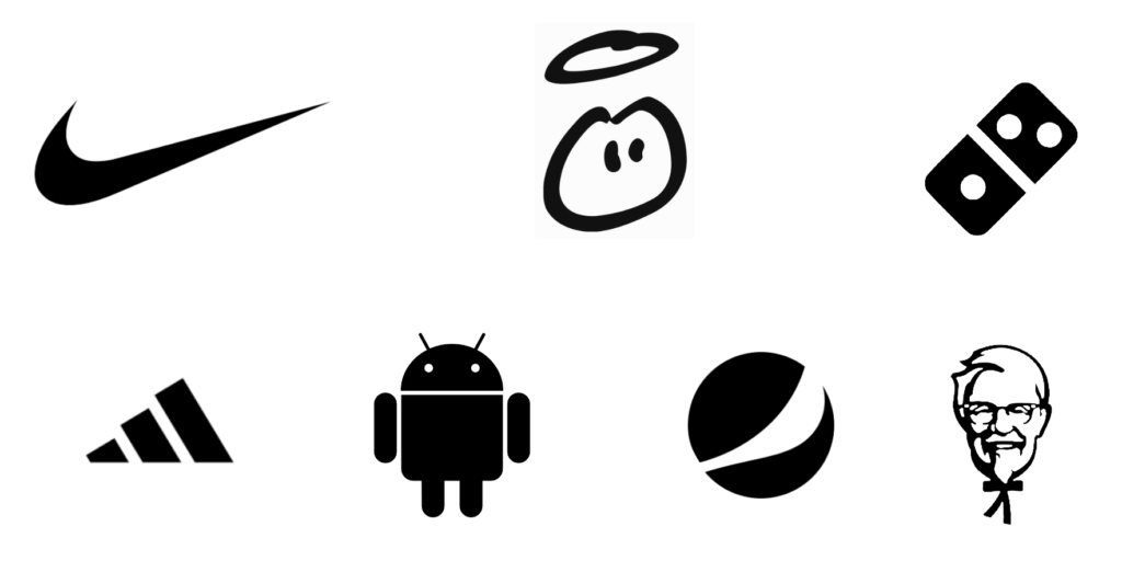
They new all of the logos and screamed them with the energetic triumph, of knowing you have the correct answer. Next up going a little more abstract to see how they fair.
Some designers use more sophisticated hidden meanings and messaging in their logos. Who can tell me what this shape is bearing in mind the company is known for insurance.
Paula Scher designed the Citibank logo. She actually had the idea and sketched it in their initial briefing session, but it then took over a year to get the logo signed off.
Some blank faces (good finally I’ve found something they don’t know), a tentative hand is raised (did I speak to soon?). “It’s a dome shape” That’s right and now think a bit deeper, why would an insurance company have a dome shape?
“Erm, maybe for protection, uh hmm”
Exactly right, now look at the dome shape and what’s below it, what could it represent?
Uncertainty glazed over the classroom like a paintbrush on canvas. I give it a couple of minutes and then explained that the ‘t’ was an abstract handle and holding something “Umbrella!” screamed a girl. Exactly it’s an umbrella which is a symbol of protecting you from, I guess in their case it’s protecting you from financial ruin.
So let’s make it even harder now (they will never get this one).
This is a logo for a delivery company. There is a hidden symbol within the logo, who can tell me where and what it is?
“I know” yelled a boy… “It’s an arrow” in between the “E” and “x”. Wow that’s impressive, how did you know this? I ask. “YouTube”. It’s amazing that kids are taking in an interest and absorbing information about Graphic Design through YouTube.
The rest of the class looked on bemused so I revealed the next slide, to a lot of gasps and ooos.
This is one of those logos that once you see the hidden symbol and message you can’t un see it.
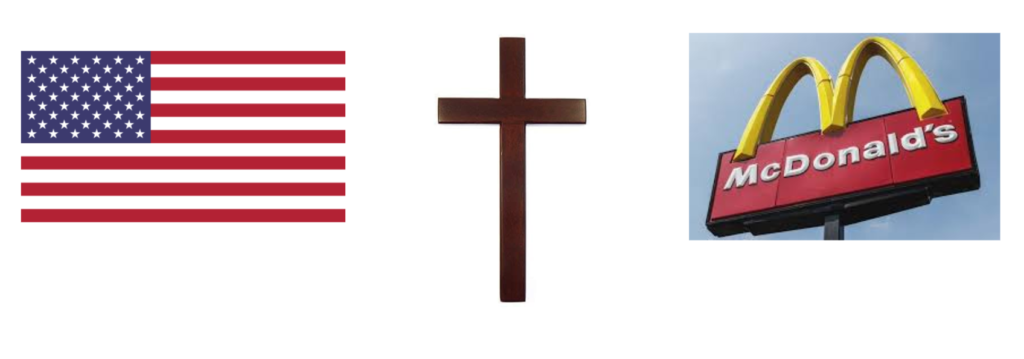
I then introduced them to a deeper level of symbolism and the dream of the man behind McDonalds’s success Ray Kroc. He was a travelling salesman and noticed the same two things of every town he went to. The American Flag and the church, he wanted the golden arches to represent the third symbol that everyone saw, something that represented the same values, a wholesome family place to visit.
After this, all that was left, was for me to hand over a brief and task them with creating their very own logo.
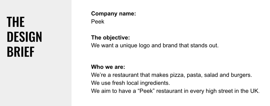
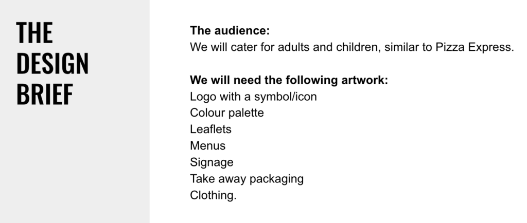
I asked them to sketch out their ideas first and then put them onto digital and with that they were all eager to get started. There class had the hum of pencils moving and paper shuffling. It felt great to see an enthusiastic classroom hard at work.
Part 3 to follow…
